
Landing page conversion in South Africa is a solvable problem, and most SA businesses have not solved it. The pages we audit fail for the same six structural reasons every time. Fixing them typically doubles the conversion rate without changing the ad spend, the audience, or the offer. It is the cheapest lever in the paid marketing stack, and it is the one most SA agencies leave alone because it is not their line item.
This piece is the honest structure: what a landing page needs to convert in 2026, what to strip out, and the SA-specific mistakes that show up on almost every audit we run.
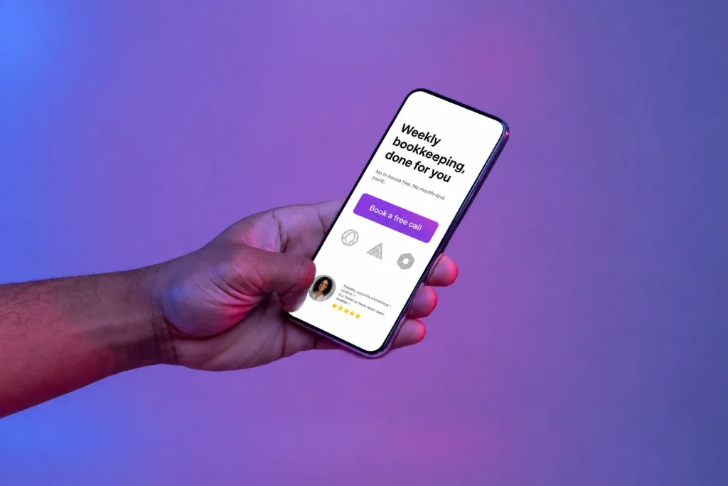
The 6 elements every SA landing page needs in 2026
- A headline that names the outcome, not the product. “Get accurate weekly bookkeeping without hiring in-house” beats “Xero-certified professional accountants”. Outcome, then product; not the other way round.
- A visible offer within the first screen on mobile. If the visitor has to scroll to find what you are offering and what it costs, half of them will not. The offer, the price (or “starts from”), and the primary call-to-action should all be visible without scrolling on a typical phone.
- Three proof points, not fifteen. A landmark client, a specific number (“267 leads generated in Q1”), and a one-line quote from a real customer. Logos, testimonials and case studies work best in this compressed form. Fifteen logos and eight generic testimonials read as noise.
- A form or CTA that respects the friction. The number of fields you ask for should match the value being exchanged. A free consultation form does not need company registration number and turnover; an application form for financing legitimately does.
- Objection handling in the copy, not in the FAQ. The three objections your buyer actually has (“is this legit”, “how long does it take”, “what if it does not work”) should be answered in the body copy, not buried at the bottom.
- A single, obvious primary action. One CTA repeated three times outperforms three different CTAs on the same page. Pick “Book a call” or “Get a quote” or “Start free trial” and commit to it.
What to strip from an SA landing page
Everything on the page that does not push the visitor toward conversion is pulling them away from it. Common cuts that lift conversion rates on SA sites we rebuild:
- The main site navigation menu. Give visitors an escape and they take it.
- Multiple CTAs at cross-purposes (“Book a call OR download the guide OR chat to sales”). Pick one.
- The blog widget, the “recent posts” list, and any other content module aimed at engagement rather than conversion.
- Sliders and carousels. Nobody clicks them; they slow the page down; they push the offer below the fold on mobile.
- Stock photos of white people in suits shaking hands. If the photos are irrelevant, remove them; do not replace with different stock.
- The five-form-field lead form when three fields would work. Every extra field cuts submit rate by 5% to 10%.
- Long paragraphs of buzzword copy. Real visitors skim; write for skimming.
The SA-specific landing page mistakes
Some conversion killers show up more on South African sites than international ones, usually because of connection speed, device mix or local expectations:
- Slow page load on mobile data. If the page takes more than 3 seconds to become interactive on a phone on 4G, a big chunk of your paid traffic bounces before it sees the offer. Fix the speed before you fix the copy. See WordPress speed fixes that actually work on SA sites.
- Trying to force sign-up before a phone number. SA buyers still convert heavily through phone calls; a page that hides the number behind a form loses the buyers who prefer to phone.
- No WhatsApp option. For consumer and small B2B categories, a WhatsApp CTA outperforms a form for a segment of the audience. Offering both is not clutter; it is meeting the customer where they are.
- Ambiguous prices in ZAR. “Starting from R2,500” beats “Contact us for pricing” for anything the visitor might reasonably compare. Hiding prices sends buyers to competitors who show them.
- Testimonials that do not name the company or the person. In SA, unverifiable testimonials are ignored. First name + surname + company + role is the minimum; a photo is better; a video is best.
- Compliance signals missing for financial services or health. In regulated categories, an FSP or HPCSA number visible on the page is a conversion booster, not clutter. It signals that the visitor is not being scammed.
How to test a landing page properly
Before running any test, measure what you have. Two numbers matter: the conversion rate you see now and the volume you are running. Below 200 conversions a month, most split tests will not reach statistical significance in a useful timeframe, so treat changes as sequential updates and compare month-on-month rather than as classical A/B tests.
Above that volume, run one test at a time, change one thing per test, and give each test 14 days minimum. The biggest lifts we see come from headline, primary image, and form-length changes, in that order.
When to build a new landing page vs fix the existing one
If the current page is loading fast, has the six elements above at least roughly, and is converting at 2 to 3%, iterate on it. If it is a slow page hacked out of a home template with the six elements missing, rebuild. A quick rebuild on an actual landing page platform (Unbounce, Instapage, or a properly-built Elementor page with cache and CDN) usually beats another round of tweaks to a broken foundation.
For the wider view on why SA websites get traffic but not leads, we covered it in the CRO playbook for SA sites. This piece is the landing-page-specific angle: the pages you build specifically to convert paid traffic, and the six things they need to actually do that.